Dovetail Gatherings
Some links may include affiliate partnerships, which means we may earn a small commission if you choose to purchase, at no additional cost to you. Please visit our Affiliate Disclosure for more information.
Designed By
Studio Founded
Branding by Lauren Ledbetter
Fonts Used
Cardinal Fruit by Production Type
Century Schoolbook by Morris Fuller Benton
Platform
The Dovetail website evokes the feeling of a slow afternoon in the kitchen. This visual softness carries throughout the site, with restrained typography and an editorial grid. It feels like a lifestyle publication or a cookbook-in-progress.
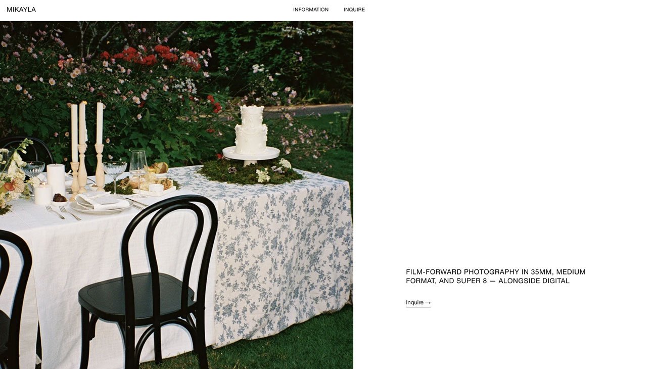
The emphasis on community and mindful living is woven through subtle editorial touches: soft photography of gatherings, short reflective phrases, and the calm pacing between sections. This combination of atmosphere and visual coherence is compelling, with a clear slow-living, design-driven focus.
Altogether, the site offers a rich, inviting world. It supports both practical home cooking and a more intentional, visually conscious approach to daily meals.


