Squarespace CSS Image Hover Effects (5 Simple Examples)
In Squarespace 7.1, a few lines of CSS can turn images into interactive elements, with hover effects like zoom, fade, and blur. This guide walks through five Squarespace CSS image hover effects for 7.1 that you can copy, paste, and customize.

What are Squarespace CSS image hover effects?
Squarespace CSS image hover effects are small pieces of custom code that add animation or visual changes to images when a visitor moves their cursor over them. They’re added through the Custom CSS panel in Squarespace 7.1.
How to Use Custom CSS in Squarespace 7.1
Squarespace is straightforward by design. Custom CSS gives you finer control over style and motion. CSS is the language that shapes how elements look and behave; in Squarespace 7.1 you can add it via Design → Custom CSS or per-page CSS.
To apply a hover effect to a single image, target its Block ID. Use an ID finder to copy the ID, then replace #block-yourBlockID in the snippets below. With that, you’re ready to bring subtle, responsive image hover effects into your Squarespace design.
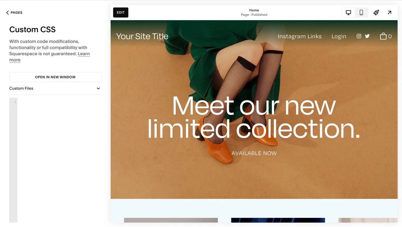
The Squarespace custom CSS panel.
Prerequisite: Identifying and Updating Block IDs
To apply these hover effects, you’ll first need the unique Block ID of the image you want to style. Each block in Squarespace 7.1 has its own identifier, allowing you to target it precisely with CSS.
How to find a Block ID:
Install the Squarespace ID Finder extension in Google Chrome.
Open your Squarespace site and activate the extension.
A grid of red labels will appear, showing the Block IDs for each section.
Click the ID you want — it will copy automatically to your clipboard.
Replace
#block-yourBlockIDin the CSS snippets below with your actual ID.
Always save your changes and refresh your site after updating the CSS to ensure your new styles take effect.
Now that we've covered the basics, let's dive into the hover effects.
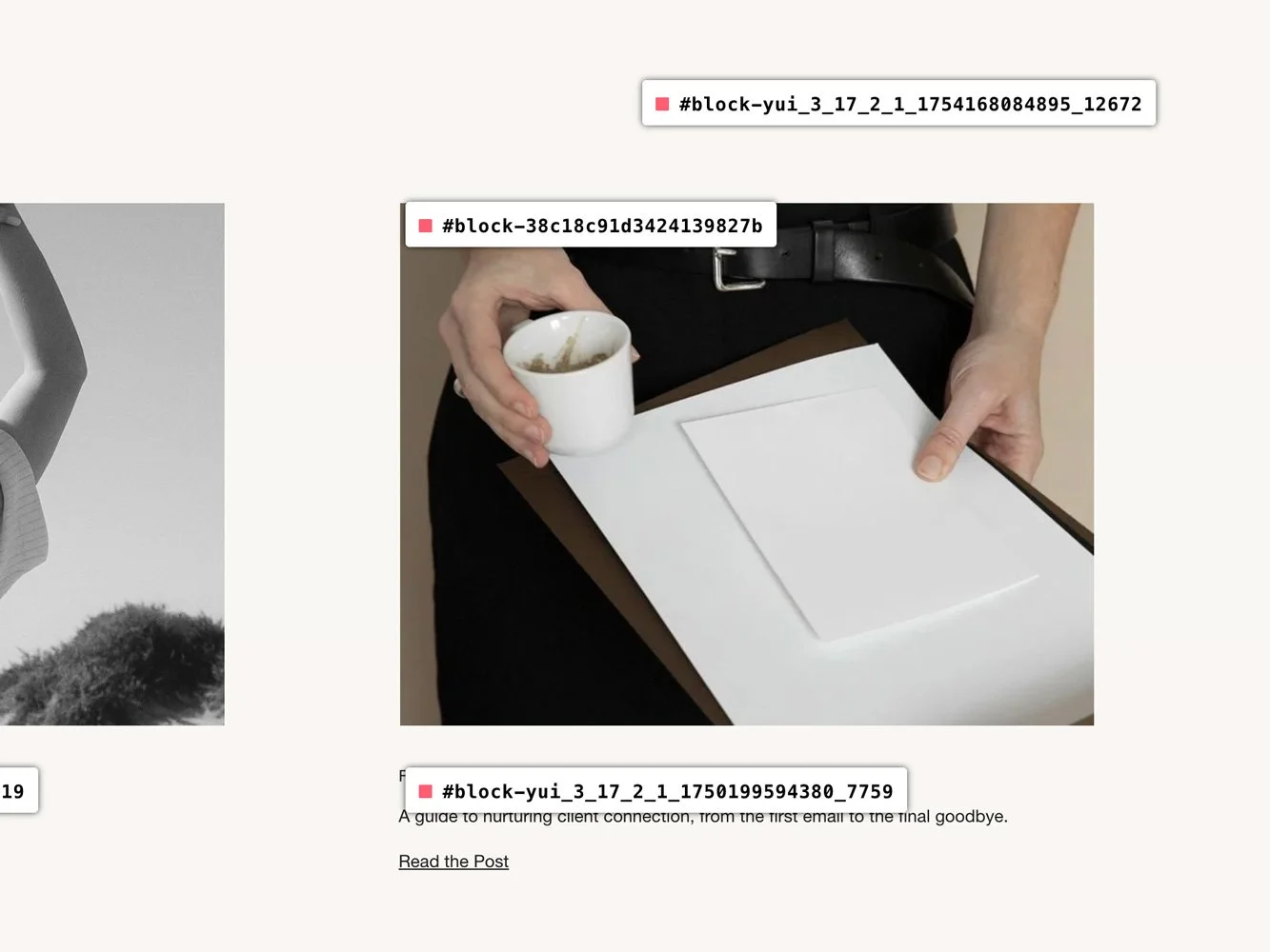
Using the Squarespace ID finder to identify block IDs.
Why Should You Use Squarespace CSS Image Hover Effects?
Image hover effects shape how visitors move through your site.
A soft zoom can draw attention to product images, a fade can make space for overlaid text, and a shift from black and white to color can highlight portfolio work. These effects introduce motion without heavy scripts or plugins, making them lightweight, responsive, and easy to add.
Used thoughtfully, they give your Squarespace site a sense of depth that encourages visitors to slow down and engage more closely with your content.
Squarespace Image Zoom on Hover Effect
The zoom on hover effect adds a touch of movement, drawing attention to key images. It’s often used on product thumbnails, portfolio galleries where you want visitors to pause and look closer.
/* Image Zoom on Hover */

#block-yourBlockID img {
  transition: all .8s ease;
}
#block-yourBlockID:hover img {
  transform: scale(1.1);
  cursor: pointer;
}
This snippet increases the image size by 10% on hover, adding subtle motion. Adjust the scale(1.1) value (for example, scale(1.2)) for a stronger effect.

Squarespace Image Opacity on Hover Effect
This effect introduces a soft fade, lowering the opacity of an image on hover to create depth and contrast. It’s often used when layering text or buttons over images, or when you want to signal that an image is clickable.
/* Change Image Opacity on Hover */

#block-yourBlockID img {
  transition: all .8s ease;
}
#block-yourBlockID:hover img {
  opacity: 0.5;
}
In this example, the image fades to 50% opacity. Adjust the value to suit your design; 0.2 for a more dramatic fade, 0.8 for a subtle shift. A value of 1 keeps the image fully visible, while 0 makes it completely transparent.
The transition property ensures the fade doesn’t feel abrupt. Adjust the timing (e.g. 0.3s for a quicker shift or 1.2s for a slower one).

Squarespace Round Image Corners on Hover Effect
Rounding the corners on hover softens the edges of an image, adding a modern, approachable feel. This works well for galleries, team photos, or any place you’d like to introduce a gentler visual detail.
/* Round Image Corners on Hover */

#block-yourBlockID img {
  transition: all .8s ease;
}
#block-yourBlockID:hover img {
  border-radius: 20px;
}
Adjust the border-radius value to shape the curve; 10px for a subtle round, 50% for a full circle.

Squarespace Black and White Image to Color on Hover Effect
This effect begins with an image in grayscale, shifting to full color on hover. It’s a striking way to highlight portfolio pieces, product features, or editorial images.
/* Black and White Image to Color on Hover */

#block-yourBlockID img {
  transition: all .8s ease;
  filter: grayscale(100%);
}
#block-yourBlockID:hover img {
  filter: grayscale(0%);
}
Adjust the grayscale value for different looks; 50% for a muted tone, or 100% for complete black and white.

Squarespace Blur Image on Hover Effect
Adding a blur on hover softens the image and creates a sense of depth. It can be used to draw focus to overlaid text or create a dreamlike mood.
/* Image Blur on Hover */

#block-yourBlockID img {
  transition: all .8s ease;
}
#block-yourBlockID:hover img {
  filter: blur(5px);
}
The filter: blur rule controls the effect. Lower values like 2px keep the image clear but softened, while higher values like 10px create a stronger blur.

Combining CSS Image Hover Effects
Hover effects work well in combination when used with restraint. For example, you might pair rounded corners with a soft fade, or add a slight zoom alongside a shift from grayscale to color. These subtle layers create a sense of interactivity that invites visitors to linger with your images.
Keep in mind: the most effective designs are often the simplest. Choose one or two effects that enhance your content, rather than stacking many that compete for attention or slow down your site.
Do’s & Don’ts of CSS Hover Effects
✔ DO keep effects subtle. Too much motion can feel distracting.
✔ DO consider page speed. Overusing effects, especially with high-resolution images, can slow a site. Use GTMetrix or Google PageSpeed Insights to check performance.
✘ DON’T use too many effects on a single page. Too many animations can overwhelm visitors and feel heavy-handed.
✘ DON’T forget about accessibility. Some users may struggle with motion-heavy designs. Treat them as enhancements, not essentials.
FAQs
-
Hover effects create subtle moments of interaction — a zoom on a product grid, a fade on a portfolio image, or a shift from black and white to color. They add depth without distracting from the design.
-
Like any new skill, it can feel unfamiliar at first. Starting with copy-and-paste snippets makes the process easier.
-
Hover effects are designed for desktop, since phones and tablets don’t use a “hover” state. On mobile, your images will display normally, which keeps the experience clean and consistent.
-
Yes, though it’s best to keep things simple. A subtle zoom and fade can feel refined together; stacking too many can slow your site or overwhelm the design.
-
Yes. If you’d prefer not to work with code, our Squarespace templates include designer-styled hover interactions as part of their layouts.
-
These snippets are lightweight, so performance impact is minimal. For accessibility, avoid making hover effects the only way to reveal important information.
-
Hover effects don’t activate on mobile devices because phones and tablets don’t use a cursor-based “hover” state.
On touchscreens, images will display normally without the hover animation. This keeps the mobile experience clean and accessible.
If you need motion on mobile, you would need a different interaction method, such as click-triggered effects.
-
If your Squarespace hover effects aren’t working, check the following:
Make sure you’ve copied the correct Block ID.
Confirm you’re targeting the image itself (img), not just the parent container.
Clear your browser cache and refresh the page.
Double-check that your CSS is added in the correct location (Design → Custom CSS or page-level CSS).
Most hover issues come down to targeting the wrong element or using an outdated Block ID.
Conclusion
With just a few lines of custom CSS in Squarespace 7.1, you can create professional hover animations without plugins or external tools.
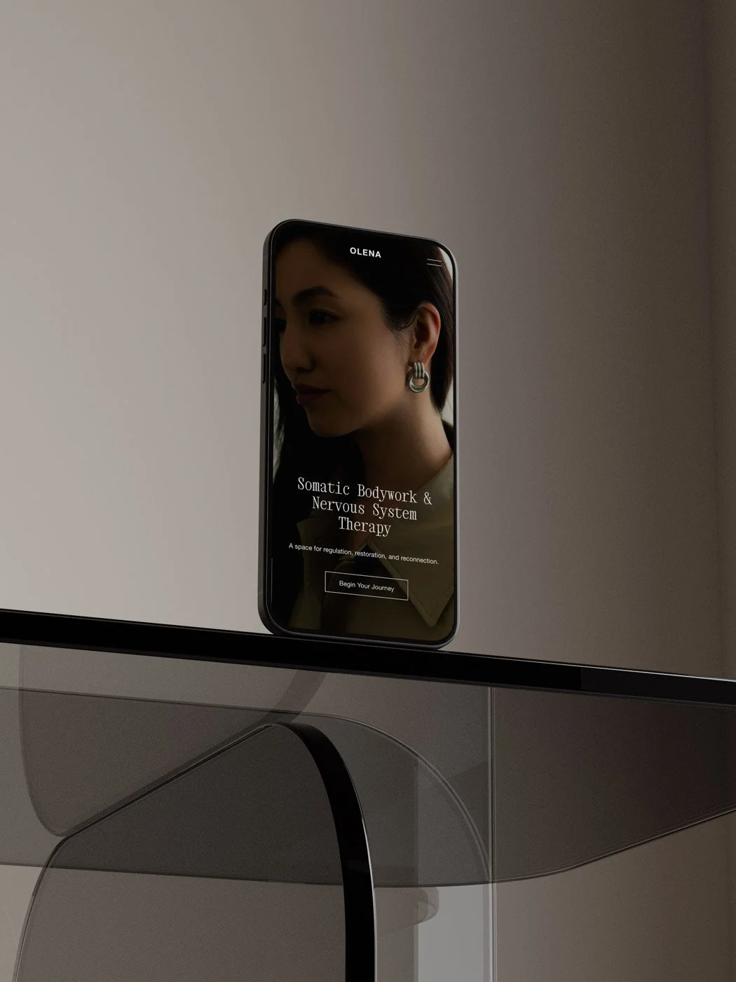
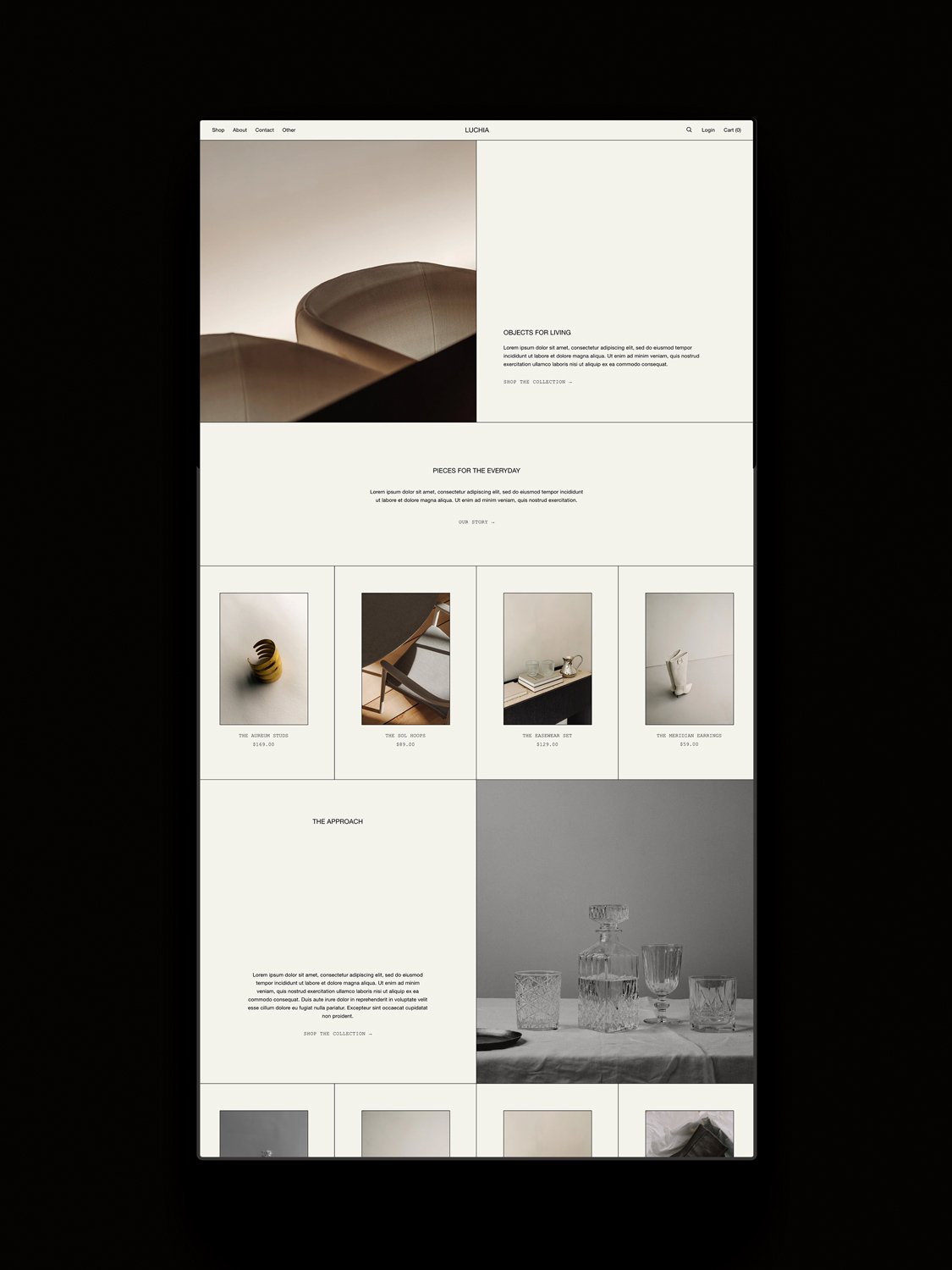
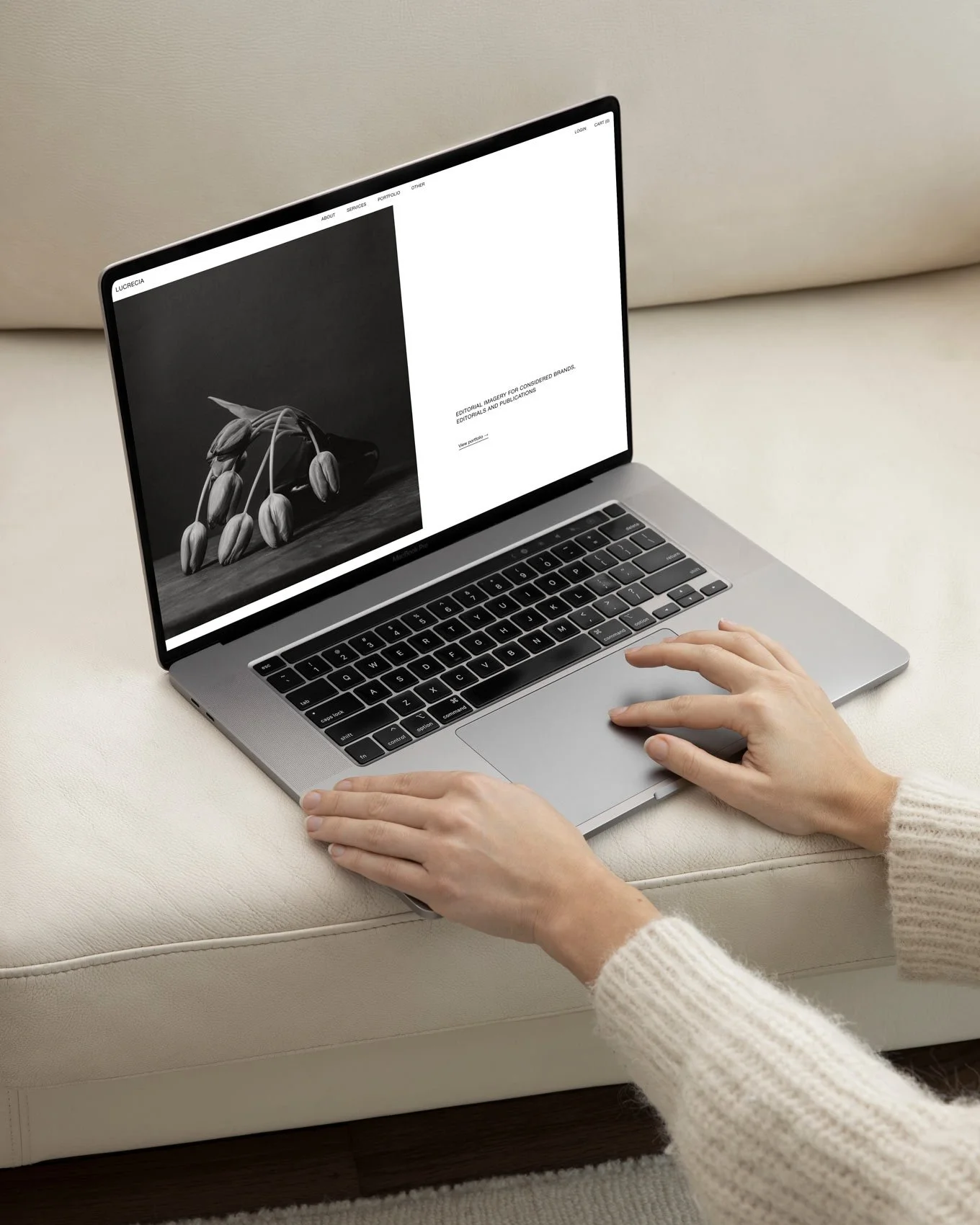
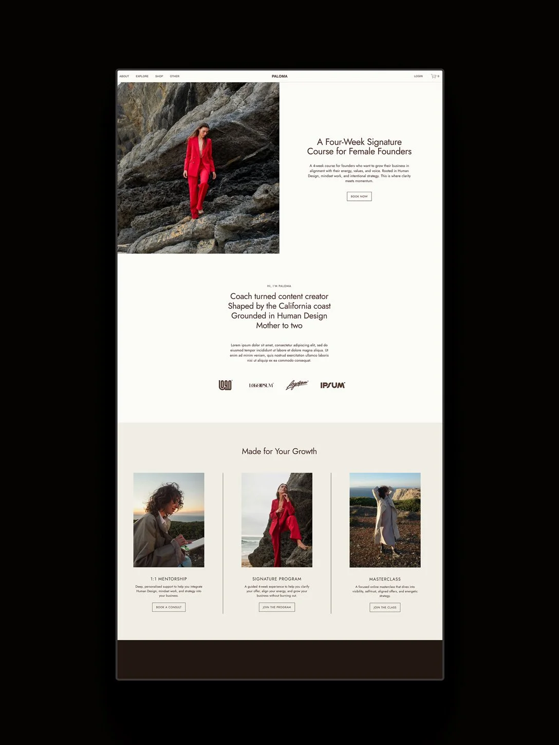
If you’d rather skip coding them yourself, our collection of Squarespace templates include 12+ pages with hover effects and other subtle design interactions already styled in.
You may also like:
How to Make Your Squarespace Site Multilingual
How to Add Custom Fonts to Squarespace 7.1
How to Start Blogging with Squarespace
Shop Squarespace Templates


